
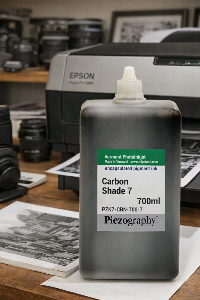
In April 2026, InkjetMall quietly discontinued the Piezography K6 and K7 ink lines. No fanfare. No transition plan. Just a notice on the website and the end of an era for dedicated monochrome fine art printing. https://piezography.com/piezography/
Most K7 users don’t know yet. They will – when the time comes to reorder. This article is for when that moment arrives. When it does, please accept my condolences “I’m sorry for your loss”, but take heart in the fact that people out there – like me – are still working with carbon pigment late into the wee small hours to produce better and better fine art mono inksets.
What Piezography K7 Discontinued Means for Fine Art Printing
The Piezography K7 discontinued announcement…”
John Cone spent decades engineering what he believed digital monochrome printing should be: seven shades of pure carbon pigment, each occupying a specific region of the tonal scale, driven by Roy Harrington’s QuadToneRIP to bypass the colour-centric assumptions baked into every OEM printer driver. The result was prints that behaved like silver gelatin or platinum-palladium — highlights that breathed, shadows that separated cleanly, midtones that felt continuous rather than constructed.
Crucially, K7 was built on a single pigment type: carbon. Neutrality wasn’t negotiated between competing chromatic inks. It was a physical property of the material itself. A K7 print looked the same under tungsten as it did under daylight. It aged predictably. It didn’t drift.
That’s what’s gone.
What Piezography Pro Is — and Isn’t
When people hear “Piezography Pro,” they assume it’s K7’s successor. It isn’t — at least not in the sense that matters to most K7 users.
Piezography Pro is essentially two K4 inksets: one warm, one cool. The system is designed for toning flexibility — the ability to blend between warm and cool to achieve a wide range of aesthetic effects. It’s elegant in its own way, and it serves a real purpose for photographers who want that kind of control.
But it’s a fundamentally different philosophy from K7.
Where K7 prioritised carbon purity and engineered neutrality, Pro prioritises tonal versatility. Where K7 used seven shades of a single pigment type to build a complete tonal architecture, Pro uses two four-shade systems designed to be blended. The neutrality you get from Pro is negotiated — a midpoint between warm and cool — rather than intrinsic to the pigment itself.
For photographers who wanted K7 specifically because of its purity, Pro is not a straight replacement. It’s a different tool answering a different question.
This distinction matters. A lot of K7 users will assume Pro is the natural upgrade and move across without realising what they’re trading away.
The Gap That’s Left
So where does that leave the fine art printer who wants what K7 provided — a pure, carbon-based, seven-shade monochrome system for a modern Epson printer?
With Piezography K7 discontinued, there is currently no commercial answer
What there is, however, is a set of open-source building blocks that make it possible to construct something equivalent — if you’re willing to go deep enough.
The pigments exist. The RIP software exists. The mathematical framework for building a geometrically consistent tonal ladder exists, documented openly by people like Paul Roark, whose carbon printing work predates Piezography and informed much of its philosophy.
What hasn’t existed — until now — is anyone pulling those pieces together, documenting the process transparently, and publishing the results.
The Finding Mono Project
That’s what I’ve been doing for the past year, without knowing it would land here.
My Finding Mono series began as a personal investigation into why neutral greys aren’t actually neutral — and spiralled through Epson’s Advanced B&W mode, into Cone’s Vermont studio, through Harrington’s QuadToneRIP, and eventually to Roark’s open-source carbon philosophy before arriving at a question of my own:
What is the best pure-carbon, seven-shade monochrome system I can build for a modern eight-channel Epson printer?
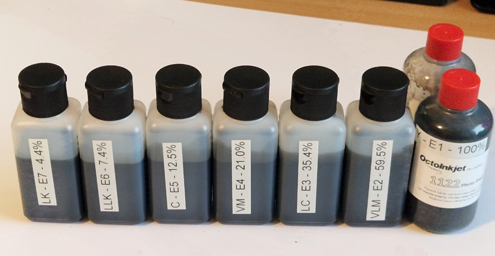
The answer I’ve been developing is built around the Eboni-7 inkset — seven shades of carbon pigment arranged on a geometric three-quarter-stop ladder. The dilution sequence follows a ratio of r=2^0.75, stepping from full-strength carbon down to approximately 4.4%:
- 100%
- 59.5%
- 35.4%
- 21.0%
- 12.5%
- 7.4%
- 4.4%
This matters because earlier six-shade carbon systems jumped too steeply in the shadows, risking blockup. The 59.5% shade stabilises the deep midtones and keeps the shadows open — the shade K7 users will recognise as doing the heavy lifting in Cone’s system.
I’m also developing an optional eighth shade at approximately 2.5% — matching PZK7’s lightest tone — for printers with an eighth available channel who want maximum highlight separation.
Where the Project Stands
I want to be honest: this is an active project, not a finished product. The Piezography K7 announcement took me as much by surprise as it did anyone else. I just happened to be halfway through my own project when it happened.
The architecture is documented. The inks are mixed. The mathematics is sound. What I’m waiting on is a hardware obstacle — faulty refillable cartridge chips that have delayed the first live prints. Replacements are on their way.
When the system is printing, I’ll publish the full methodology openly: dilution ratios, pigment sources, curve-building approach, and print results. Everything documented, everything reproducible, nothing behind a paywall.
This isn’t a commercial venture. It’s a documentation project — the kind of open, transparent work that Roark did for carbon printing and that Cone, in his best years, did for monochrome inkjet printing as a craft.
For context: a full K7 inkset imported from the US to the UK cost upwards of £800. The Eboni-7 pigments for my entire seven-shade system cost under £100. I added refillable cartridges and a second-hand Epson R3880 as a dedicated test bed — total outlay under £250. The philosophy was never behind a paywall. Only the supply chain was.
The pigment is available in the UK from OctoInkjet, who decant from MIS bulk stock — no transatlantic shipping, no import duties, no minimum order that assumes you’re running a print studio.
The Journey So Far
The context for all of this is in the Finding Mono series, published here since early 2026:
- Finding Mono: Epson’s Advanced B&W — Where the rabbit hole opens
- Finding Mono – John Cone – The Grey Rabbit — The history and philosophy of Piezography K7
- Finding Mono – Roy Harrington – QuadToneRIP — The RIP that made K7 possible
- Finding Mono – Paul Roark – Carbon Sensei — Open-source carbon philosophy
- Finding Mono – A Geometric Ladder for a Modern Printer — The architecture of the Eboni-7 system
- Finding Mono – Building My Custom Inkset — Mixing, formulation, and setup
A Note to Fellow K7 Users
If you’ve just discovered that Piezography K7 is discontinued and you’re trying to work out what to do next — I understand the feeling. This series started because I was looking for the same thing you are.
I’m not selling anything. I’m not offering a drop-in replacement you can order today. What I can offer is the most detailed public documentation of what a pure-carbon K7-equivalent system looks like in 2026, published openly as I build it.
If you have knowledge of this space — if you’ve worked with carbon pigments, built your own curves, or explored alternatives to Piezography — I’d genuinely welcome the conversation in the comments below.
This is a small community. It’s worth talking to each other.
Guy Carnegie is a fine art nude and figure photographer based in Inverurie, Aberdeenshire. His Finding Mono series documents the pursuit of the perfect monochrome fine art print