
Stop‑press (April 2026): InkjetMall has officially discontinued the Piezography K6/K7 ink lines. With K7 no longer produced, EBONI‑7 now stands as the only actively maintained seven‑shade monochrome inkset available for modern Epson printers. This wasn’t planned – it’s simply where the timeline has landed – but it gives my EBONI‑7 project a new historical context. – https://piezography.com/piezography/
Original Article
On paper, neutrality looks simple. Feed a printer equal values of R, G and B, or a balanced mix of C, M and Y, and you should get a perfect grey. That’s the promise of colour management: numbers in, neutrality out. But the moment you leave the controlled world of the display and enter the physical world of ink, paper and light, those illusions start to wobble.
Modern inkjets build “neutral” greys by blending multiple pigments, each with its own spectral fingerprint. Cyan leans one way, magenta another, yellow another still. Even when the colour management system does its best to balance them, you’re still looking at a negotiated truce between pigments that were never designed to be neutral in the first place. Change the light source, and the truce breaks. Change the paper, and the balance shifts again. Neutrality becomes conditional.
Epson’s Advanced B&W mode is the closest the colour‑printer world gets to stability. It leans heavily on the printer’s two or three carbon blacks, using the colour inks only to steer tone. Most of the time, the results look astonishingly neutral straight from the printer. But the real challenge isn’t how an ABW print looks on day one – it’s how it behaves over time. A tiny contribution of Light Cyan here, a whisper of Light Magenta or Yellow there, and you’ve introduced pigments that don’t age at the same rate as carbon – or even as each other! Months or years later, a midtone that once looked perfectly neutral can drift warmer or cooler as the chromatic components fade or shift. It’s subtle, but once you understand the chemistry, you realise that ABW’s neutrality is always provisional. It’s a performance, not a resting state.
And this is the moment the rabbit hole opens. Because if neutrality built from chromatic inks is always a performance, then the only way to get a grey that is grey – under any light, on any paper, at any tone – is to start with a pigment that is neutral by nature.
https://piezography.com/
I didn’t stumble into Piezography by accident. Its name kept drifting toward me from the edges of printing forums, blog posts, and late‑night searches. People talked about it the way you talk about a secret technique or a lost craft. “Seven shades”. “Carbon purity”. Curves that behaved differently from anything Epson had ever intended. At first, I treated it as background noise – another niche solution for people with more time and money than sense, but the more I read, the more it intrigued me. Eventually, curiosity won. I clicked one link too many, followed one thread too far, and suddenly there was the Grey Rabbit standing in front of me, tapping its foot, calling for me to “Keep up!”
This Grey Rabbit, of course, has its own origin story:
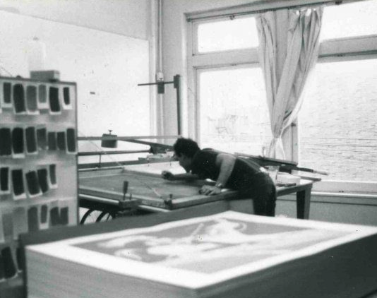
In his small printmaking studio in Vermont, John Cone had been quietly refining the art and chemistry of monochrome inkjet printing for decades. Long before most people realised that digital mono printing could be anything more than a compromise, Cone was in his lab designing multi‑shade carbon inks, building curves and treating digital monochrome with the seriousness of a traditional craft. This wasn’t a hobbyist tinkering in a garage. It was a working studio, a family operation, a place where neutrality and tone were engineered with the same care you’d expect from etching or platinum printing. The more I learned about what Cone had done in Vermont, the more the Grey Rabbit made sense.
https://piezography.com/about/piezography-history/
Jon Cone had been developing monochrome inkjet systems throughout the 1990s: Graytone100 in 1993; ConeTech archival inks in 1994-96; and the DigitalPlatinum system in 1997-98 – all of which laid the groundwork for what would become PiezographyBW in 2000.
PiezographyBW was the monochrome inkset that emerged from Cone’s early work. At its core were six carefully selected shades of carbon pigment, each one responsible for a different region of the tonal scale. Driven by Cone’s own profiling software, PiezographyBW relied on the OEM Epson driver, using a custom ICC profile to persuade a colour‑centric print pipeline to behave like a monochrome one. It worked, but only within the limits of a system never designed for multi‑shade carbon.
The emergence of Roy Harrington’s QuadToneRIP changed everything. QTR bypassed the OEM driver entirely and offered direct, per‑channel control of the printer’s inkset – exactly the mechanism Cone’s architecture had been waiting for. With QTR in hand, Cone rationalised the PiezographyBW line into a seven‑shade “K7” system, dropping the idea of shoehorning a monochrome ICC into a print‑space designed for colour. The K7 curves were equally deliberate, designed to behave like tonal architecture rather than the usual ICC contortions.
What Piezography promised was simple: neutrality, permanence, and tonal grace. What it delivered was something closer to a revelation. Prints that looked less like inkjet output and more like silver gelatin or platinum‑palladium. Highlights that breathed. Shadows that separated cleanly. Midtones that felt continuous rather than constructed. And, crucially, a neutrality that didn’t drift with time or light because it was built entirely from carbon.
Its influence on the world of dedicated monochrome fine‑art printing has been profound. Piezography didn’t just raise the bar – it redrew the map. It showed me that digital monochrome can be a discipline in its own right, with its own physics, its own craft, and its own aesthetic possibilities. For many photographers, it has become the benchmark against which all other approaches were measured.
But admiration isn’t the same as access. The deeper I went into John Cone’s world, the more I realised how difficult it would be to bring any of it into my own practice. Piezography was built for high‑volume studio use – for printmakers running editions, not for someone making occasional, ad‑hoc prints in the UK. Importing from Vermont was prohibitively expensive, and even the European distributors carried only fragments of the K7 ladder in sensible quantities. The system felt complete, but the supply chain didn’t. Cone’s focus has shifted from tonal perfection toward commercial flexibility – the dual‑tone Piezography Pro system, essentially two K4 inksets (one warm, one cool) designed for toning rather than maximum pigment resolution – it became clear that the world I’d discovered wasn’t quite aligned with the world I needed.
This Grey Rabbit had offered me a seat at the tea‑party, with many wonderful dishes on the table and a host of other interesting characters to boot.